“Twilight” stands as a fall favorite
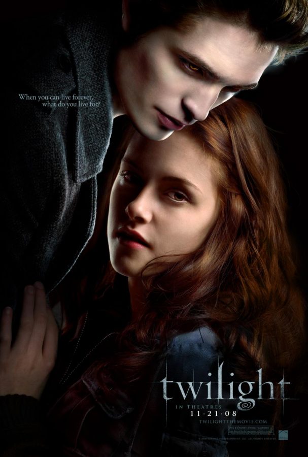
Photo courtesy of IMDb.
November 9, 2021
This previously ran in our October 2021 print issue.
As the thermostat slowly slinks down and sunsets come around earlier, the anticipation for my favorite holiday, Halloween, begins to set in. This year however, my usual ritual of enjoying fall activities and snuggling up with cozy movies will definitely include a solid binge session of what I recently have discovered to be one of my favorite series: Twilight.
Now, let me preface this by saying that I can’t quite completely disagree with the jeers and criticisms from the majority of the population who have a distaste for the films, and I completely understand why most film buffs would definitely laugh me out of the room if I even tried to put up a fight for the 2000s classic. However, I really do enjoy the movies and the sticking power of their irrevocably sappy plotlines.
Unlike most 17-year-old teen girls, I unfortunately did not watch the movies or read the books as a child. In fact, it wasn’t until this summer that I gave in and decided to watch the series–ironically at first, but soon falling in love with the painfully cliche yet gripping story. As I struggled through young Kristen Stewart’s plastic acting and Robert Pattinson’s “mysterious” stares (I swear, this movie definitely confirmed that angsty staring is a love language), the first aspect of the movie that caught my attention was the color. Throughout the entire first film, the cinematography emphasized the cool, somber blue tones that built up the backbone for the tone and mood of the film’s eerie settings. From scenes like the beach trip to the perpetually overcast streets of Forks, the blue hue owned each frame and seemed to reach through the screen to convey the same moody mood directly to me. This brilliant use of color was also one of the main features that allowed the film to characterize events that would usually be thought of as cheery and nostalgic. Scenes like the beach trip on the characters’ senior skip day and when Stewart’s character, Bella Swan, goes prom dress shopping with her friends are turned into moody moments that lets the viewer tune into Bella Swan’s detached and isolated perspective on life. The tones in some scenes almost allow the viewer to see the world as Bella does: bland, peaceful, and overall uninteresting, until it comes to Edward, who is nearly always shown with bright white tones and shimmering highlights of lighter blue and green.
Aside from the beauty of each shot and careful thought behind the balance of color, the soundtrack that builds the depth behind each moment arguably outdoes the movie itself. I repeatedly found myself stunned by the quality of the song choices that were incorporated into character introductions and main events. With iconic tunes like “Supermassive black hole” that seemed to perfectly distill all the grungy goodness of the early 2000s alongside pieces by Radiohead’s rock icon Thom Yorke, the film perfectly crafted a stereotypical yet incredibly personal high school narrative. The song choices also fit the characters perfectly, as it doesn’t seem far-fetched to imagine a scene of Bella Swan and her cryptic, shimmering, diamond boy Edward powering on their iPods and listening to the characteristically early 2000’s tunes–something that adds another dimension to the familiarity the viewers are able to build with the characters.
Perfectly capturing the growing pains of adolescence, the series has grown to be a timeless treasure from the 2000s’ culture; it allowed me to sit back, relax, and soak in all the vampy teen angst in peace as I laughed and compared over-dramatized representations of fictional 17-year-olds to my own life.